Hover over the images to learn more. On a phone? Tap.
Gething Design redesigned the MTA GoPass, the ticket required to board public transit in Maryland.
Anti-microbial resistance has been an alarming public health concern since the '80s. Outwitting microbes with an arsenal of new drugs, when they keep reinventing themselves to evade the old ones, is a game of futility a lot like vintage asteroids: they just keep coming. This illustration accompanied an article on AMR for HealthyWomen.org.
First and Franklin church was established in Baltimore in 1761. Today, its congregation is progressive and inclusive; its spire is prominent in the downtown skyline. All of these things and warmth are conveyed in their logo and collateral.
One of a set of logos developed for a medical/science writer of great speed and precision. The mark cleverly combines a ninja throwing star with old style pen nibs—the perfect symbol for an editor ruthless about slashing lines and carving syntax.
Taciturn Press, Seattle, WA, is billed as a "publisher of few words." Because of the owner's focus on South and Central American subjects, the letter T was combined with shapes that reference ancient pottery and artwork.
To celebrate Read Across America 2022, Maryland State Education Association gave thousands of books to Baltimore City Public School libraries, pasting this bookplate inside each one. Posters, a social media campaign, and alternate bookplates are now in the works based on the success of the first. Gething Design is proud to be part of an effective literacy campaign.
The Teachers Association of Anne Arundel County wanted to update an old logo depicting an old-timey schoolhouse desk. Their new branding reflects union values of inclusivity, activism, and solidarity. The new mark is now adapted for letterhead, signage, t-shirts, website, and e-news campaigns.
What an honor to work with Janet Felsten of Baltimore Green Map to design this passport to celebrate Druid Hill Park, a 745-acre greenspace opened in Baltimore in 1860. The passport helps families discover and explore the park and its many historic spots, like the Rawlings Conservatory & Botanic Gardens, the Baltimore Zoo, its trails and oddities. At each visited location, a sticker-stamp could be collected for the booklet.
We all remember how fraught voting became at the height of lockdown in 2020, and how critical voting by mail became. "Posty" the mailbox was created to put a friendly face on the process and offer simple instructions in this social media campaign to get out the vote—postage-free!
The Handel Children's Choir of Baltimore didn't want to come off as stuffy or overly serious. A classical font — at least as old as Handel — was chosen, but it was the arrangement of musical notation and color, suggesting a playful jester, that struck the right note. The HCC monogram elicited a "Hallelujah!" from the client.
HCC was presented with a number of lively solutions for their logo, including this single-line cartoon of Handel's recognizable face. The board wrangled over the choice, but Handel and his bubbly wig came in second fiddle.
A simple solution for an organization shining a bright light into the darkest corners of environmental issues. The Center for Environmental Invesigations is based in Washington D.C.
The Lower Shore Safe Well Water Initiative is a joint effort of the Assateague Coastal Trust, Center for Progressive Reform, Environmental Integrity Project, and University of Maryland School of Public Health. In communities with heavy agricultural activity, this elective testing initiative for private wells on the Eastern Shore of Maryland needed an appealing look that would welcome citizens to participate, ensuring safe drinking water for all.
Maryland Natural Health Center, in Owings Mills for over 20 years, will open a satellite location at Quarry Lake to expand their well-established acupuncture and naturopathy practice. It was time to update their logo. The leaves symbolize the plants on which naturopathic medicine is based; the needles stand in for acupuncture. A balanced holistic view is the name of the game.
In 2016, Larry Hogan referred to teachers’ union members as “union thugs.” Asked to create a campaign for member-educators and activists of the Maryland State Education Association, Gething Design made use of the invective as a tongue-in-cheek clarion call. The campaign was applied to posters, t-shirts, notebooks, and buttons, and worn to Annapolis by union members protesting during the legislative session.
A logo for a new funding campaign designed for the Pennsylvania State Education Association combines two education images in a novel way.
Learning League is an afterschool tutoring program in Colorado designed to close learning gaps and foster greater literacy, post-pandemic.
When HealthyWomen.org wanted to tackle the under-covered subject of female orgasm they contacted us for an eye-catching and demystifying approach to the science of sex.
An infographic synthesizing the data on the opioid epidemic sounded a clear alarm coupled with an article on the crisis in Maryland schools created for the Maryland State Educators Association.
Gething Design helped HealthyWomen.org convey the curious similarities between male and female sleep issues during middle age to accompany their article.
A report by the Environmental Integrity Project revealed that 24 new and expanding liquefied natural Gas Terminals in U.S. Could Add 90 million tons of greenhouse gases a year—as much as all the traffic in New York state. We designed a poster/graphic to accompany the press conferences on national news and in the EIP report.
Graphic illustrations engage readers to learn health tips from HealthyWomen's exploration of middle age.
The Blueprint for Maryland's future is a landmark piece of legislation passed in 2021. It calls for comprehensive changes MD public schools, increasing funding by $38 billion over the next decade. The Blueprint aims to improve student outcomes and education quality. "Bringing the Blueprint to Life" tackles the challeges of fulfilling the legislative promise, which Gething Design depicted as a complex, interconnected Rube Goldberg machine.
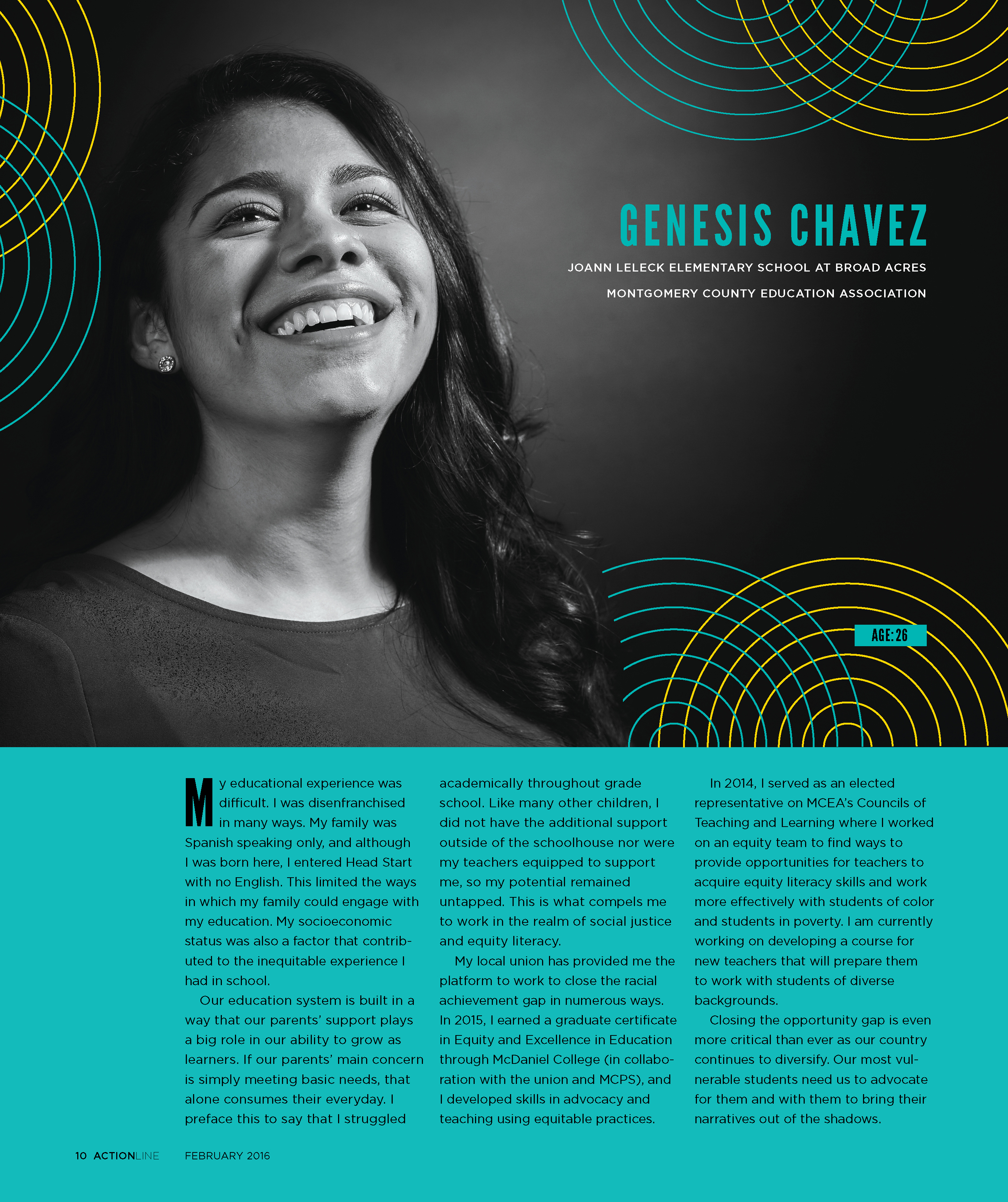
ActionLine is the magazine for Maryland Educators. A new generation of activist teachers has earned the respect of their legislators and communties.